
How do I design a word in Aravrit?
A new word in Aravrit, as it turns to be, goes through a long and winding road.
I receive many requests for typing a word for someone, thinking that it would be easy since it’s a font. I explained why this is not the case in the past.
In this post, I want to share with you parts of the process that every new word goes through. And what would be a better way, than to use the new hug word for that.
An idea is popping up
Every word is a world. Each has its meaning and associations connected with it. I take the first stage of choosing a word very seriously because it needs to resonate with people. Since I’m a Hebrew native speaker, I normally start with the Hebrw word in mind. However, I do get requests for inspiring words in English too, and then it’s my responsibility to find the best translation in Hebrew.
Figuring out the Arabic translation is key. Arabic is so rich and full of dialects. Before starting, I need to know in which dialect I am designing the word. Normally, it would be Palestinian-Lebanese. Depending on the context, it can be Yemeni Arabic or Persian. Finding the most accurate translation to go with the Hebrew takes time and I always ask more than one person how they would pronounce and spell the word.

First rough sketches
For the first sketches I need to know how the words in both scripts are spelled. It sounds basic, but it’s a very good step in starting to imagine how the letters are going to be stitched together. After over 7 years of designing Aravrit, I can look at two words and already visualise which letter parts from both scripts will be merged.
I start by drawing them roughly on paper. I’ll be absolutely honest, I cannot draw well (and yet, managed to get up to a Master’s degree in typeface design). The goal of this stage is to feel the script’s flow and find joint areas that will later become one Aravrit word. By the end of this stage, I’ll know what connects with what and what the structure of the hybrid word will be.
Going digital
This is when things get real. And slow. I break down both words and start combining piece by piece. I always leave a version of each complete word for reference. Next, I place each half-letter on top (or below) its companion. At this stage, it’s still hard to imagine that about 9 hours later, it will look like one word.
Once each letter part is roughly in its position, I start working on combining them. I test a few alternatives for the style of the joint (round? sharp?) and the thickness of the strokes and settle on what works best.

It’s a fun and tedious dance of marco and micro. The design at this stage is focused on one hybrid letter at a time (AKA micro). However, I am constantly zooming out and looking at the entire word to make sure that all the letters are looking like they live together.
What I often think of and try to avoid, is a situation when one letter stands out too much. Like a person dressed in sneakers at a fancy 19th century ball. Does it make sense to you? Or it is just me attributing human qualities to type.
Things are starting to connect and I continue working on the construction of the new words. This involves removing some parts which are not essential for the letter’s legibility and using some strokes for both letters. It’s a very delicate balancing game and my absolute favorite part.
Feedback is key
Once the word is designed and before it’s finalised, we start with the first round of feedback. The sketches are sent to my talented Arabic consultant, Azza Alameddine. Azza is from Lebanon, and is a professional typeface designer. She usually receives a few variations and then starts another favorite part: the ping-pong.

Azza looks at the Arabic and gives me feedback on what is not legible enough. Legibility is key in Aravrit. If one cannot identify the letters, then the whole point is missed. Then, we go into style, where she shares her opinions on the Arabic and how it works together with the Hebrew.
She asks, I reply and she asks again. I am so moved by the discussion, that talks about compromising and finding sweet spots of similarity in two very different-looking scripts.


Challenging roadblocks
Obstacles in the form of challenging letter parts are always appearing. We discuss them and iron them out, one stroke at a time. I hear her opinion and immediately go back to the drawing board (well, screen). I modify not only the Arabic but the Hebrew as well. At this point there is no “Hebrew here and Arabic here” but a few, very funky looking, hybrid letters.
A challenge for example is when a letter looks like a different one. This harms legibility and has to be changed. At times, solving a problem is possible after spending some time away from the words. Then, in a lightbulb moment, the better form appears. It’s a mix of trial and error and intellectual puzzle. And sometimes, compromises. The range of possible modifications is almost endless: contrast, endstorkes, width or style (Arabic has many script styles, more than Hebrew. I normally design in Naskh). After I settle on an improved structure and the word is clear, it’s time to move on to the next stage.

Stylistic features
This is what I call the transparent stage. Slight modifications of moving nodes and measuring stem widths. This work is at the core of every typeface designer and is meant to make the word look coherent and crisp. Moving a notch down, trying a different instroke. For others, it may look like pure craziness. This is where the difference between hobby and profession lies.
Aravrit is not a typeface (or a font) but a writing system. Therefore, I can choose to apply any type style that contributes to the feeling I want to evoke. The letters can be angular or curvy, heavy weighted or light and airy. Knowing the intended application of the word also helps in deciding with style to persuade. For instance, if the word is planned to become a sculpture, it is very likely that i’ll design the letters heavy and sturdy so they will not break easily. I often have an idea of the style in the rough sketches stage, but as design is not science decisions can and do change.
Informal feedback
Very early in the process of creating Aravrit, I discovered that I also need feedback from Hebrew readers. It was not enough that I managed to read my designs, because I know beforehand what is written. Showing the designed words without context is key for success. If people cannot decipher the text easily, the concept of Aravrit fails. I am being very careful with this and this stage always increased my heartbeats. Will they manage to read?
I show the word to several people, both Hebrew and Arabic speakers. Some are family, friends and colleagues and some are newbies to Aravrit. People who have never seen this writing system before. I often show 2-3 drafts with different letters joints and ask for their opinion.
After getting their feedback, at times with many more modifications to the design, I know that I am done. And then, I work on it some more. Time away and different lenses always helps to grow and improve.
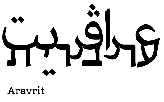
Showing native Arabic speakers a design for the first time. They can easily read.
The application
When the word is ready, I start working on the application for a product on the shop, or a custom logotype which involves some graphic design. The word is the raw material and the applications are what will live in the physical space. In the case of hug, it was clear to me from the start that I will use it for a product which is daily and basic. Most importantly, effortless. I am a big believer in the power of daily activities to convey a concept. Especially now, it was important to address our need for human connections.
Below, you will find a video I made talking about the idea behind the hug T-shirts and see some of the process.
Every word is an end result of a long process. When people read the word easily, I know that hard work pays off. Since we are all about sneakers in the ballroom, let me give another metaphor: you know the effortless hairstyle which takes forever to assemble but looks so simple? Aravrit is like that.


